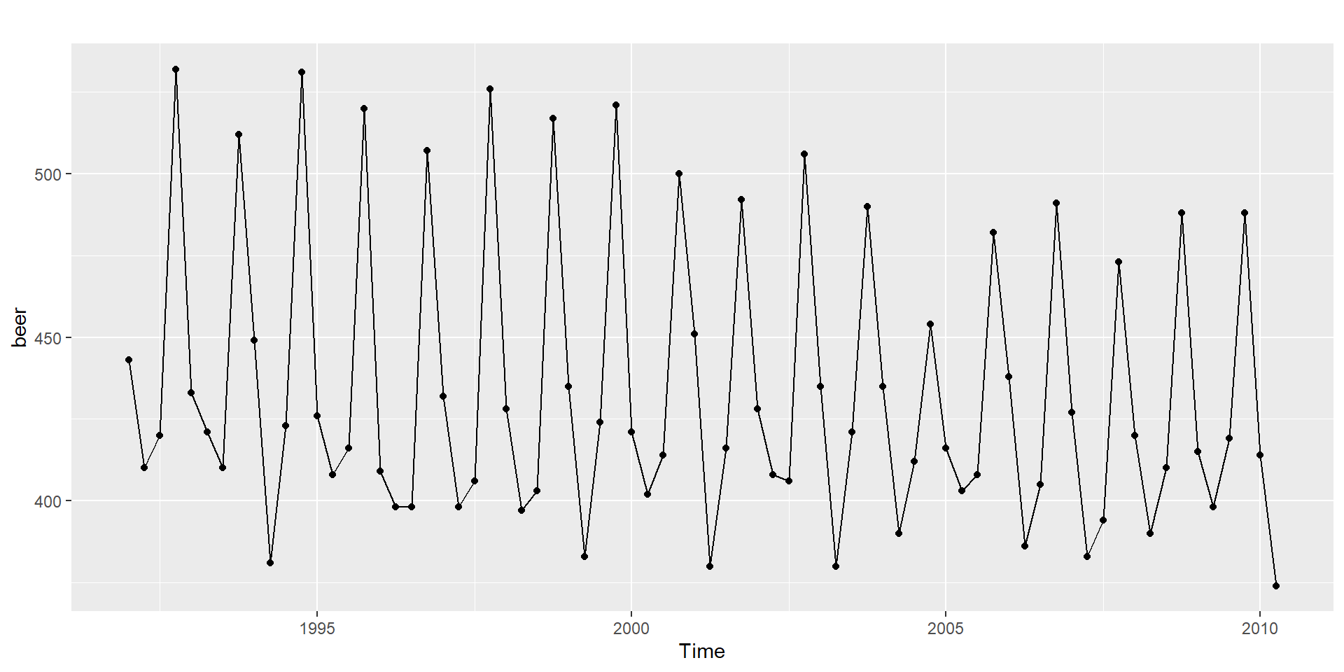
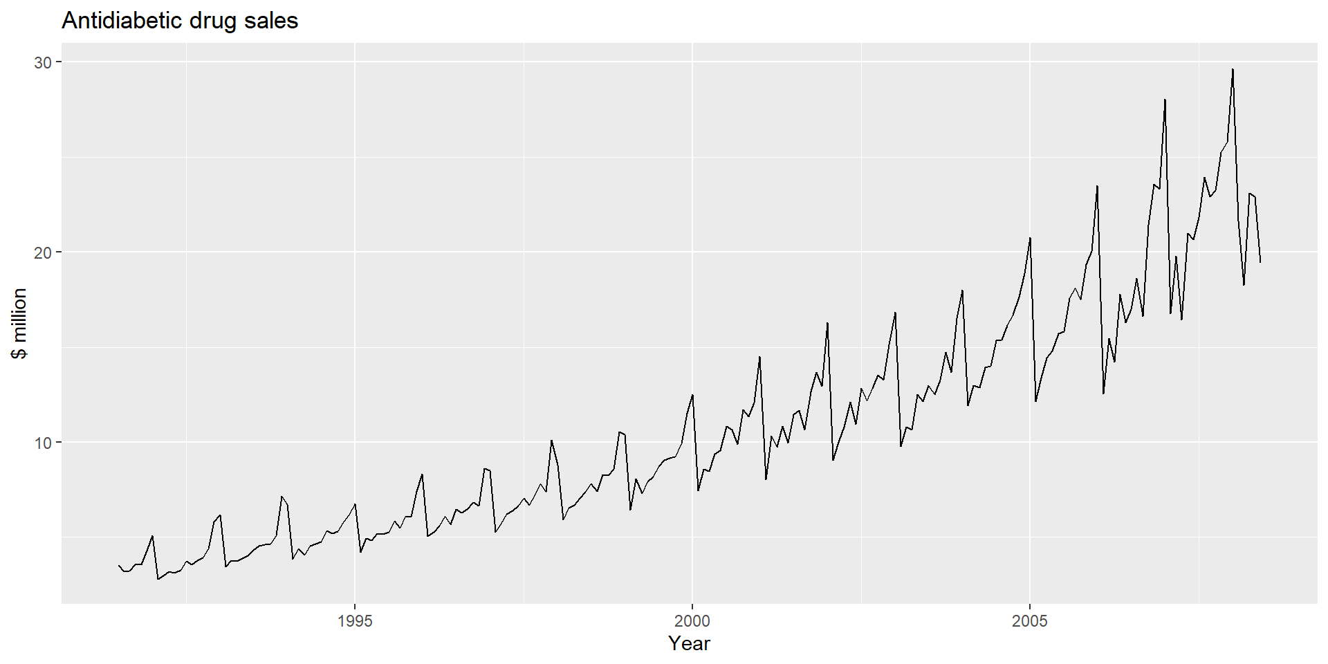
     Qtr1 Qtr2 Qtr3 Qtr4
1992  443  410  420  532
1993  433  421  410  512
1994  449  381  423  531
1995  426  408  416  520
1996  409  398  398  507
1997  432  398  406  526
1998  428  397  403  517
1999  435  383  424  521
2000  421  402  414  500
2001  451  380  416  492
2002  428  408  406  506
2003  435  380  421  490
2004  435  390  412  454
2005  416  403  408  482
2006  438  386  405  491
2007  427  383  394  473
2008  420  390  410  488
2009  415  398  419  488
2010 414 374 Time Series Analysis
Looking at this plot, what are some ways to improve its clarity, aesthetics, or data presentation? Are there specific adjustments you would suggest to enhance its readability and ensure it effectively communicates the intended message?

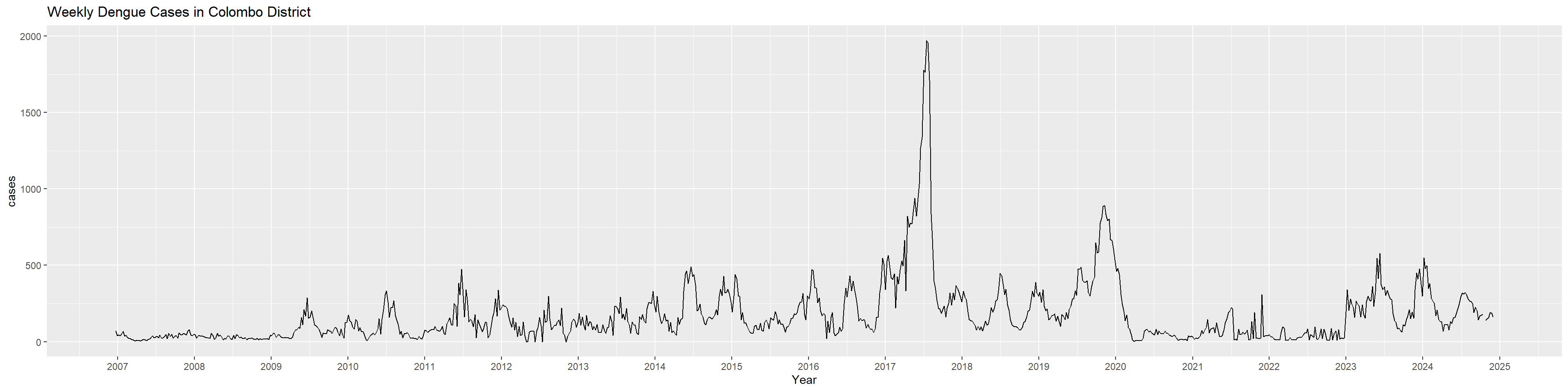
What insights can you derive from this chart? Interpret the key patterns, trends, and any notable observations it presents in relation to the data context.
What additional chart types or visualizations could be created to provide complementary insights or highlight different aspects of the dataset?
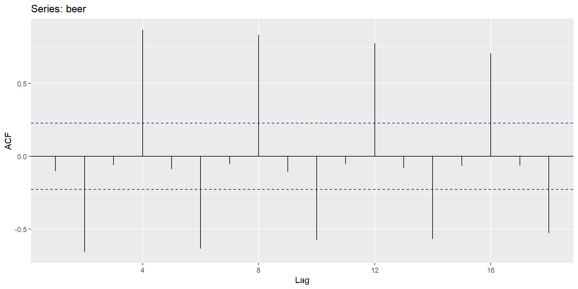
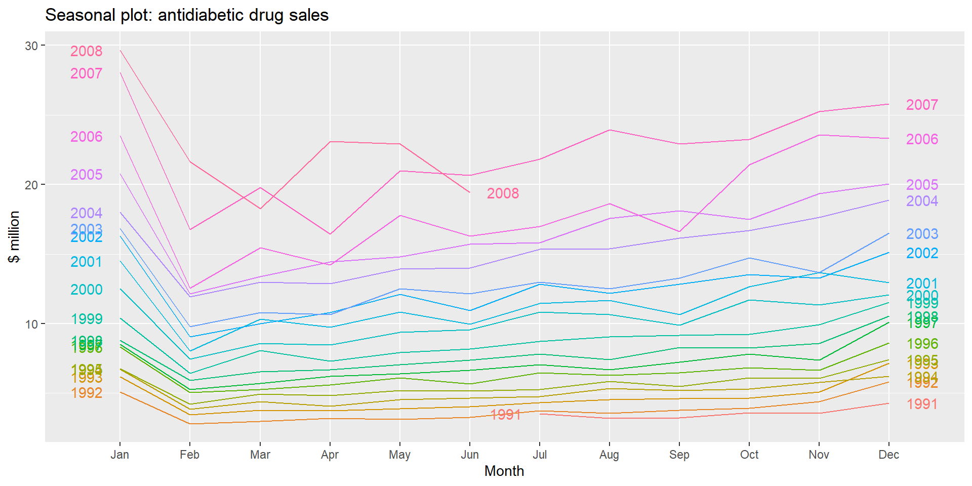
Interpret the plot
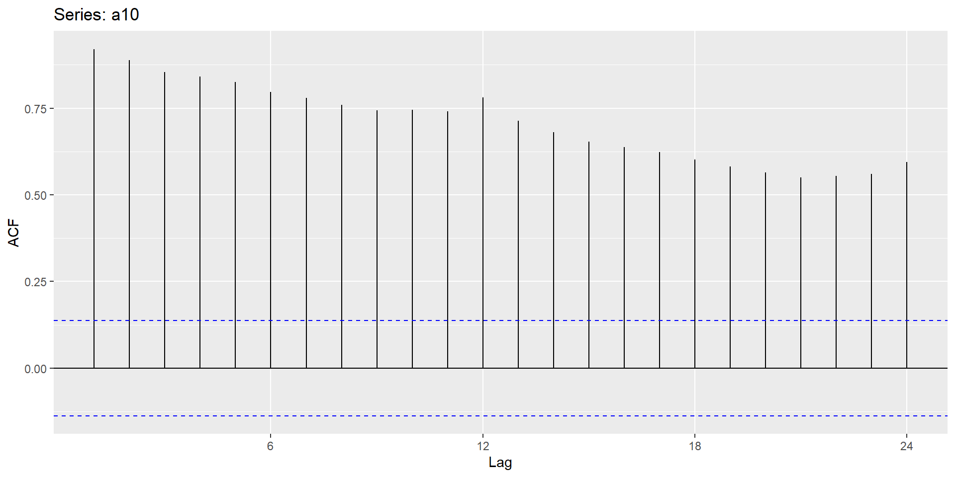
ACF plot for the original series
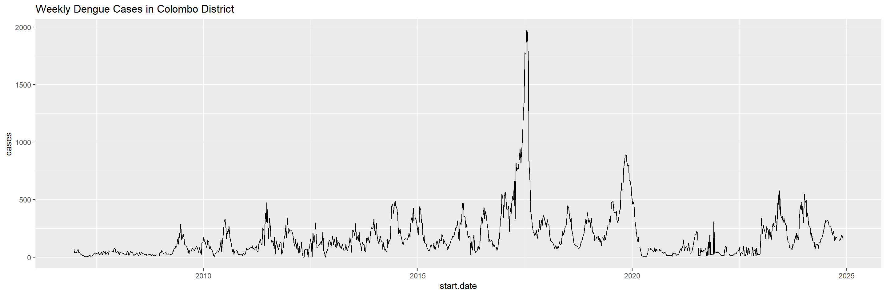
Draw the ACF plot of the following time series